Thursday, December 9, 2010

Design:Part II

This is a continuation to my previous post, Design. Please Read this first blog entry here...

Gutenberg Diagram
navigating dense information
 The Gutenberg Diagram is a diagram that describes the general pattern followed by the eyes when looking at any media, such as artwork, webpages, newspapers, magazines, and advertisements. This principle is based metaphorically on reading gravity, like how we as americans have learned to read from top left to right and down a page of information. Designers will complement this principle by placing important graphic elements starting at the top left and along the pathway of the eye toward the end area
.


Legibility
good typographic practice
 Legibility is the visual clarity of text, whichis based on the size, typeface, contrast, text block, and spacing of characters. For example, when choosing a font to use for a text that is featured in a  design, you would probably not choose a font that is difficult to read, or too small. A bad use of legibility is using the color yellow in front of a white background with a small font.

Rule of Thirds
A Technique of composition in which a medium is divided into thirds, creating aesthetic positions for the primary elements of a design.
To put the rule of thirds in effect, you basiclly divide a piece into thirds both horizontal and vertically so that there is a grid. At every intersection of the lines indicates a good focal point to make the piece interesting. The rule of thirds is so popular, that Photoshop has a grid you can place on your canvas that follows the rule of thirds. Here is an example of the rule of thirds in effect.


Again, I highly recommend you purchase Universal Principles of Design by William Lidwell, Kritina Holden, and Jill Butler. This book features all of these, plus many more design principles. It can be bought at Amazon.com using this link here.

-AA

Tuesday, December 7, 2010

Tools for Artists

While doing my daily blog surfing, I found a couple of online tools that can be really useful to any artist. I discovered both tools on the Academy of Art Character and Creature Design Notes Blog. 
Did I mention that they are all free?

The first tool will help you with your gesture drawings. It is called the 'Human Gesture Drawing Practice Tool'. It is featured on a website called Pixelovely, and you can find the link to the tool here.
Basiclly this tool generates random images of humans in different poses, so you can practice drawing them. You can even customize the settings, such as choosing different time intervals to switch between images, choosing the gender of the models, and choosing nude models or clothed models. They even feauture an 'Animal Gesture Drawing Practice Tool', where you can choose mammals, birds, insects, rodents, and aquatic animals to draw. It it a great tool to start practicing your gesture drawing skills. Even if you a beginner like me, I still recommend to at least try and draw some of the pictures it features. There is nothing to lose, because all you can do is move forward.

The second tool is called the 'Color Scheme Designer.' You can find this tool here. This tool lets you pick and choose different colors, but it restrains you to different color schemes, such as complementary, triad, tetrad, analogic, and accented analogic. This is a great tool to play around with, and it will definitely help you when deciding on a color scheme for a design or art piece.


You should definitely check both of these tools out. What is there to lose?

-AA

Sunday, December 5, 2010

Bad Romance

The other day I was surfing Youtube, and I stumbled across this remake of Lady Gaga's Bad Romance Video.
In my personal opinion, it is wonderfully done, with even the littlest details almost matching the orginal video. Take a look for yourself.

Original Lady gaga music video:


And now compare it to Sleepybum682's recreation.


The video was created and posted by Sleepybum682's youtube channel.
Not only has Sleepybum682 recreated Bad Romance, he recreated many other Lady Gaga Music video's, such as Pokerface, Pappaazzi, and Telephone. The videos Sleepybum does are made in the Sims2 video game software. I have never played Sims, so I really do not know how it works, but what I do know is that the stuff Sleepybum does is incedible. If you are a Lady Gaga fan, or a Sims fan, then I really encourage you to check out his channel.

-AA

Thursday, December 2, 2010

Design

So one of the key elements in artwork, movies, commercials, advertisements, photographs, architecture, and products is Design. How something looks is very important when it comes to trying to appeal to an audience. Design can be the dividing line between a successful piece, or a boring piece. So the question is how do you make sure the Design is perfect?

Universal Principles of Design by William Lidwell, Kritina Holden, and Jill Butler is a book that is filled with design techniques that can enhance usability, influence perception, and increase appeal. It can be bought at Amazon.com using this link here. It is a great book that I recommend to anybody who is an artist, photographer, director, designer, or entrepreneur. I'm not going to give away the whole book, but I am going to talk about some of the design principles that this book features.

Storytelling
A method of creating imagery, emotions, and understanding of events through an interaction between a storyteller and an audience.
Storytelling can be any instrument of information that engages an audience to vicariously experience an similar set of events. Elements of storytelling that can be used as a framework for the design of most things include setting, characters, plot, invisibility, mood, and movement.


Fibonacci Sequence
mathematical order in nature.
Fibonacci Sequence is a sequence of numbers in which each number is the sum of the preceding two.
A great example of this principle in use is Da Vanchi's Mona Lisa. The whole placement of the woman in the painting is based off of the Fibonacci Sequence
This pattern is also found in most classic art forms, such as poetry, art, music, and architecture.


Golden Ratio
A ratio within the elements of a form, such as height to width, approximating 0.618.
Examples of the things with the golden ratio include the Parthenon, a Stradivarious Violin, the Notre-Dame Cathedral, a Nautilus Shell, Eames LCW Chair, iPods, and da Vinci’s Vitruvian Man.

The man in this drawing is perfectly proportioned with the Golden Ratio.


Good Continuation
aesthetic relatedness
 This means that elements arranged in a straight line or smooth curve are perceived as a group, and are interpreted as being more related than elements not on the line or curve.The smooth repetitive design line tends to dominate our attention.The relatedness in design lines contribute to the overall recognition of designed objects and are therefore more aesthetically pleasing.

Closure
holistic patterns
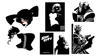
 Closure is a tendency to perceive a set of individual elements as a single, recognizable pattern, rather than multiple, individual elements. Logos use this principle to simplify the form to a basic one, so the logo can be recognized better. Lots of them use geometric shapes that are near each other, because they are more easy to understand. Comic books and video games also use this principle to simplify the visual story.
A great example of Closure is Frank Miller’s Sin City comic book series. Here are some examples of his comics:


Figure-Ground Relationship
directing eye to what’s important

 This means that elements are perceived as either figures (objects of focus) or ground (the rest of the perceptual field). As humans, we separate things of interest into either figure or ground elements.Figure elements are in focus and ground elements are undifferentiated. To tell whether things are figures, or ground, follow these hints:
Figure has definite shape 
Figure seems closer in space
Elements at the lower region of a design are more likely figures.

Ground continues behind the figure
Ground seems farther away in space
Elements at the lower upper region of a design space are probably ground. 

Here is a classic example of Figure-Ground Relationship....
When you look at it, you can either see a Vase, which is the figure, or two profiles of faces, which is the ground.


-AA 

Tuesday, November 30, 2010

Artist Profie: Iain McCaig

Iain McCaig is a well-known, award winner artist, character designer, concept artist, illustrator, screenwriter, producer, author and art instructor. His skills in  concept work, character design, and storyboarding make him a gem in the motion picture industy.  He has worked on major motion pictures, such as the Star Wars trilogy, Terminator II, Hook, Interview With the Vampire, Dracula, and Harry Potter and the Goblet of Fire. He even co-founded Ninth Ray Studios LLC back in 2005. It is a freelance story and design group which has provided pre-production and development for several feature films including Outlander and John Carter of Mars.
http://characterdesignnotes.blogspot.com/2010/11/iain-mccaig.html 

I really admire Iain's artwork, which you can admire yourself in his book "Shadowline: The Art of Iain McCaig".

 What is even more awesome is that he evens find some time in his super busy lifestyle to keep up with his very own blog, which is linked below:
 http://iainmccaig.blogspot.com/

His blog features his artwork, biography, and different links. He even has various "how-to" illustrations, such as how to draw hair, and how to draw an eye (This was actually very useful for me). He also has a post on facial expressions. If you have a few minutes to spare, I highly recommend visiting his blog. I don't know about you, but if I was offered to have a few free drawing lessons from Iain McCaig, I wouldn't hesitate.

-AA

Monday, November 29, 2010

Let your colors burst.


A few weeks ago Katy Perry came out with a brand new music video for her hit single "Firework". In the video, Katy inspires hope in a few individuals who are experiencing troubling situations by reminding them that everyone has a fire inside; it just needs to be ignited. The visual effects for in the video were made possible by Reel FX. It so happens that Reel FX, the digital studio that my group was assigned to research in the Intro to ATEC course that I am taking.

The video was shot in different locations of Budapest, Hungary. Radium/Reel FX Visual Effects Supervisor Kevin Althans and Producer Leigh Mergehenn went along to Hungary during the shoot, so they could successfully plan the logistics of the practical effects and the post-production work. According to Kevin Althans, the whole process was collaborative. Their team of 40 staff members in both the Dallas and Santa Monica Studios worked on editing the video for two weeks to create the realistic effects shots. The final look of the fireworks was achieved using custom Houdini plug-ins (written by 3D Effects Artist Anthony Chappina)which generated the dynamic fireworks. Other tools included Houdini, Maya, After Effects, Nuke and Inferno.

The "Firework" video is one of my favorite music videos. Not only are the visual affects incredibly realistic and believable, but the message of "embracing your inner firework" is truly meaningful. The video also brings up issues of bullying. Katy Perry noted that the video has personal significance to her and has dedicated the track and video to the “It Gets Better” campaign, which addresses discrimination and bullying against LGBT youth.

                                                             http://www.radiumreelfx.com/news

You can see the video and it's entirety here.

-AA

http://presskitchenblog.wordpress.com/2010/11/15/radiumreel-fx-makes-sparks-fly-for-katy-perry/

http://www.radiumreelfx.com/commercial/work/katy-perry-firework

Thursday, November 18, 2010

Million Dollar Idea

So a random thought occurred to me the other day: How do writers come up with original ideas for movies?

Ever since the making of movies, there have been so many different plots used: A giant monster terrorizing a city. A cruise ship full of passengers sinking in the middle of the Atlantic. A psychotic woman kidnapping and keeping a public figure against his will. How do the writing team create a clever and interesting story for a movie without ripping a previous plot line off?

But speaking of original plot lines, Some of my favorite animated movies come from Pixar, a very popular Animation Studio. The reason I love their movies (besides the incredible animation) is because all of their plots are extremely original. Don't forget the fact that all of their movies are family friendly feel-good flicks, which is a guilty pleasure of mine.

So I want to give major props to all the writers at Pixar and all of the other Movie companies. You all have both an extremely hard and important job, but you definately "bring home the bacon" in the end. Kudos.

-AA

Thursday, November 11, 2010

Hands

What is the first thing you notice when you see an animated character?
Probably their facial expressions and posture/stance. Perhaps their clothing and body type. I mean, that's the first thing I look at when a new character appears on screen.

But when I was browsing some blogs, I noticed a lot of posts about the emphasis of characters' hands.

One blog I found, called the Academy of Art Character and Creature Design Notes, has three entire blog posts dedicated to just sketches of many types of hands in many various positions and angles. 

Here's one of the pictures.


You can view the rest of the blog posts herehere , and here.
 
Toby Shelton's blog also has a post on hands. He tells us that expressive hands can have a big impact on the post and gesture of the characters. Hands also tell the characters attitude. If you want to be an artist, sooner or later you're going to have to draw hands. Having hand drawings in portfolios are a good idea, to show that you can illustrate good emotional expression through body movements and stance.

Drawing hands accurately takes practice. I would know, since my hand drawing skills are quite poor.(I am getting better though). But if drawn accurately, hands can show a lot of emotion in characters, which is a key element in animations.

-AA

Wednesday, November 3, 2010

Hi there!

***Congratulations! If you are reading this, you have stumbled upon my very first blog post on my very first public blog. Before you start reading on, let me warn you that am brand new to the blogging world, so please excuse my inexperience to entertain readers. But trust me, I will try to make this blog as interesting as possible. Now, where should I start?***

My name is Kory.
I am eighteen years old.
I am currently a freshman enrolled in The University of Texas at Dallas.
My major is ATEC(Arts &Technology).
As of now, I plan to minor in Visual Art.
My favorite color is turquoise.
I love my family and friends.
I love music.
I love movies.
I love art.

So the reason I majored in ATEC was to pursue my dream of someday working at an Animation Studio such as Dreamworks or Pixar. ATEC has many areas of study, such as game design, sound design, and animation. The area of study I decided to pursue is 3D animation. The only thing is, I currently have very little to no experience with how the animation process works, the different  animation software, and the overall lifestyle of the professional animation industry. With that being said, here is where the blog comes in.

I consider myself a complete amateur when it comes to art and computers. Sure, I've taken a digital graphics class in high school, so I have a little background experience with Photoshop, Illustrator, and Flash. I also took a couple basic art and drawing classes, but other than that I am a complete beginner in the world of technological art and design.
I know that I am only a freshman in college, and you're probably thinking that the whole point of college is to gain knowledge in your area of study, and that college is the place to start learning how to do everything you didn't know how to do before. I  totally understand this. The only thing is that there are many other freshman in ATEC that have much more experience in the artsy stuff(incredible drawings and paintings) and tech-e stuff (knowing adobe software forwards and backwards), so I feel a little disadvantaged.
But instead of being pessimistic about it, I'm going to embrace it. The only direction I can move is forward, right? :)

So here comes the point of this blog. I am going to use this blog as a sort of learning tool. It's going to be a learning tool for me, and a learning tool for all of my lovely readers. Every time I find out some new information on art, animation, Photoshop, etc., I am going to blog about it. It could be either information on an animation company, different art techniques and artists, or some tips and shortcuts on how to do a task in an adobe software. I might even post some of my own art, to see what you guys think. Basically the subject matter can vary on each post (Although my posts will be relevent in the matter of increasing my skills for becoming an animator).
This blog will be an experience. Hopefully a positive experience in which you and I can gain useful knowledge.
It starts now.

-AA