Universal Principles of Design by William Lidwell, Kritina Holden, and Jill Butler is a book that is filled with design techniques that can enhance usability, influence perception, and increase appeal. It can be bought at Amazon.com using this link here. It is a great book that I recommend to anybody who is an artist, photographer, director, designer, or entrepreneur. I'm not going to give away the whole book, but I am going to talk about some of the design principles that this book features.
Storytelling
A method of creating imagery, emotions, and understanding of events through an interaction between a storyteller and an audience.
Storytelling can be any instrument of information that engages an audience to vicariously experience an similar set of events. Elements of storytelling that can be used as a framework for the design of most things include setting, characters, plot, invisibility, mood, and movement.
Fibonacci Sequence
mathematical order in nature.
Fibonacci Sequence is a sequence of numbers in which each number is the sum of the preceding two.
A great example of this principle in use is Da Vanchi's Mona Lisa. The whole placement of the woman in the painting is based off of the Fibonacci Sequence

Golden Ratio
A ratio within the elements of a form, such as height to width, approximating 0.618.
Examples of the things with the golden ratio include the Parthenon, a Stradivarious Violin, the Notre-Dame Cathedral, a Nautilus Shell, Eames LCW Chair, iPods, and da Vinci’s Vitruvian Man.

The man in this drawing is perfectly proportioned with the Golden Ratio.
Good Continuation
aesthetic relatedness
This means that elements arranged in a straight line or smooth curve are perceived as a group, and are interpreted as being more related than elements not on the line or curve.The smooth repetitive design line tends to dominate our attention.The relatedness in design lines contribute to the overall recognition of designed objects and are therefore more aesthetically pleasing.
Closure
holistic patterns
Closure is a tendency to perceive a set of individual elements as a single, recognizable pattern, rather than multiple, individual elements. Logos use this principle to simplify the form to a basic one, so the logo can be recognized better. Lots of them use geometric shapes that are near each other, because they are more easy to understand. Comic books and video games also use this principle to simplify the visual story.
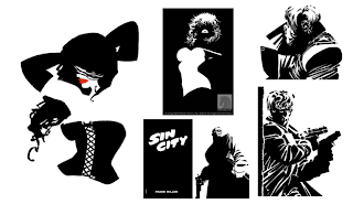
A great example of Closure is Frank Miller’s Sin City comic book series. Here are some examples of his comics:
directing eye to what’s important
This means that elements are perceived as either figures (objects of focus) or ground (the rest of the perceptual field). As humans, we separate things of interest into either figure or ground elements.Figure elements are in focus and ground elements are undifferentiated. To tell whether things are figures, or ground, follow these hints:
Figure has definite shape
Figure seems closer in space
Elements at the lower region of a design are more likely figures.
Ground continues behind the figure
Ground seems farther away in space
Elements at the lower upper region of a design space are probably ground.
Here is a classic example of Figure-Ground Relationship....

When you look at it, you can either see a Vase, which is the figure, or two profiles of faces, which is the ground.
-AA
No comments:
Post a Comment